Mexican Pink
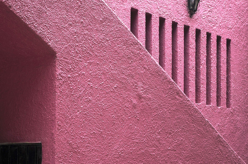
Photo of Barragán architecture (in Mexico City) shared to Flickr under a Creative Commons license.
The COLOR CODEX series — to which SEMIOVOX has invited our semiotician colleagues from around the world to contribute — explores the unexpected associations evoked for each of us by specific colors found in the material world.
Last winter I borrowed a copy of Tanizaki’s book In Praise of Shadows about the Japanese preference for dimly lit architecture and objects that show the patina of time. On silver and copper, he says, “we love them for the burnish and patina, which they (Americans) consider unclean, unsanitary, and polish to a glittering brilliance.” At that point I looked down from the pages to the glittering brilliant silver rings on my fingers.
My family comes from the silver-mining town of Taxco and my grandfather was a silversmith and muralist. I inherited some silverware from my grandmother, and ritualisticly polish off its tarnish until my hands turn black and the silver is white (pure silver is not silvery).
Tanizaki observes that Americans “paint their ceilings and walls in pale colors to drive out as many of the shadows as they can”. I’m not an expert on Japanese culture in any way, but have thought about writing my own very un-Japanese small book, In Praise of Color, on that Mexican proclivity for hyperbole and brightness that’s not without mystery or paradox. No, we don’t paint anything in pale colors. We are loud. And we hold a natural predilection for the loudest of all colors, Mexican pink.
Perhaps every Mexican has their own iteration of an archetypal memory in which they stand in front of a titanic wall of rugged pink. There might be a bougainvillea blooming nearby, or dust and nothingness, or in my case, black volcanic rocks. It’s hue, like Mexico, is all emotion. It feels like it’s always been there and will always be there. It feels chic and futuristic, it feels Nahua and primordial, it feels like its purpose is cutting through the thick slices of time.
Here, pink is a spiritual colour. It’s not plastic, but mysterious, indigenous and expansive; never shy, never just a touch of pink. And once you’ve seen it, you intuitively understand that this architectural shade is meant for walls, but not all walls. It belongs in rough surfaces with a sense of weight and texture for maximum effect. If possible, they should avoid having any discernible utility at all. Its more elevated form is perfectly pointless and massive, but that kind of opulence is just for the rich.
Any efforts to tame it by restraining it to small enclosures, smooth or digital surfaces, or worse, nationalistic campaigns, will result in a garish and perverse effect. I think it’s a symptom of our politicians’ corrupt spirit that they often try to scrub up governmental agencies by painting them in an official polished bright pink, inevitably making the additional mistake of adding a dash of white in lettering, or margins, or doves, or whatever to take the edge off. But the muse of primal vitality doesn’t answer to cheap calls.
In some archaeological sites, tourists can learn the secrets of making the deep reddish dyes out of cochineal that the original civilizations in Mexico used for textiles and stucco decorations. After 1518, it was introduced to Europe and highly valued for its longevity and an intensity that is more refracting than reflective. In an unlikely afternoon dyeing course in the rainy Kew Gardens, I learnt that it gives a distinctive tone of Mexican pink when applied on paper.
Where Japan loves the shadows of void, Mexico loves the brightness of plenum. Mexican pink has a fullness that contains one of our foundational ideas: that there’s no sacredness without vitality, shamelessness and a loud scream of profanity.
COLOR CODEX: Martha Arango (Sweden) on FALUKORV RED | Rachel Lawes (England) on DEVIL GREEN | Audrey Bartis (France) on KYOTO MOSS | Maciej Biedziński (Poland) on SKIN-DEEP ORANGE | Natasha Delliston (England) on MARRAKECH MINT | Whitney Dunlap-Fowler (USA) on RESURRECTION CANARY BLUE | Ximena Tobi (Argentina) on VILLA MISERIA BRICK | Aiyana Gunjan (India) on LETTERBOX RED | Lucia Laurent-Neva (England) on TEAL BLUE VOYAGER | Charles Leech (Canada) on STORMTROOPER WHITE | William Liu (China) on PINING GREEN | Ramona Lyons (USA) on GOTH PURPLE | Greg Rowland (England) on LAUNDROMAT FUTURA | Sónia Marques (Portugal) on RUNAWAY BURRO | Max Matus (Mexico) on CALIFORNIAN BLUE | Chirag Mediratta (Canada / India) on AUROVILLE ORANGE | Alfredo Troncoso (Mexico) on BORGES GLAUQUE | Josh Glenn (USA) on TOLKIEN GREEN | Clio Meurer (Brazil) on PARIS LUMINOUS GREY | Serdar Paktin (Turkey / England) on AMBIENT AMBER | Maria Papanthymou (Russia / Greece) on AGALMATOLITE WHITE | Sarah Johnson (Canada) on ARMY GREEN | Vijay Parthasarathy (USA) on ALPHONSO YELLOW | Tim Spencer (England) on ELECTRO-EROTIC COBALT | Adelina Vaca (Mexico) on MEXICAN PINK.
Also see these global semio series: MAKING SENSE (Q&As) | SEMIOFEST SESSIONS (monthly mini-conferences) | COVID CODES | SEMIO OBJECTS | COLOR CODEX | DECODER (fictional semioticians) | CASE FILE | PHOTO OP | MEDIA DIET | TATTOO YOU (semioticians’ tattoos).