Kyoto Moss

Image by darkness_s from Pixabay
The COLOR CODEX series — to which SEMIOVOX has invited our semiotician colleagues from around the world to contribute — explores the unexpected associations evoked for each of us by specific colors found in the material world.
I’d dreamed since childhood of visiting Japan, and in 2012 I was finally living the dream — traveling in that country for a month, using the famous Japan Rail Pass to go from one city and region to the next. Just before I left home, a friend of mine — a fellow semiotician — had given me a precious list of his favorite places to visit and second-hand markets. So in addition to buying colorful kimonos and yukatas in flea markets, I’d been visiting some of his recommended destinations. One of these was a district of Kyoto known for its small temples, with their beautiful dry gardens featuring careful arrangements of rock, sand, pruned trees, and moss.
Moss is one of my favorite plants, so the combination of moss with traditional Japanese architecture really raised my expectations. My experience in Kyoto, however, went far beyond even what I’d imagined.
While searching for this temple district, I got lost. A nice woman led me onto a bridge, in order to give me a wider view of the area — and to point me to the place I was looking for. The small temples were quiet, peaceful wooden spaces in Kyoto’s soft spring atmosphere. Gardens of rock and moss were visible through perfectly proportioned wooden frames. Waves and strict lines in white sand. Delicately painted paper walls. Everywhere I looked, beauty was playing hide-and-seek.
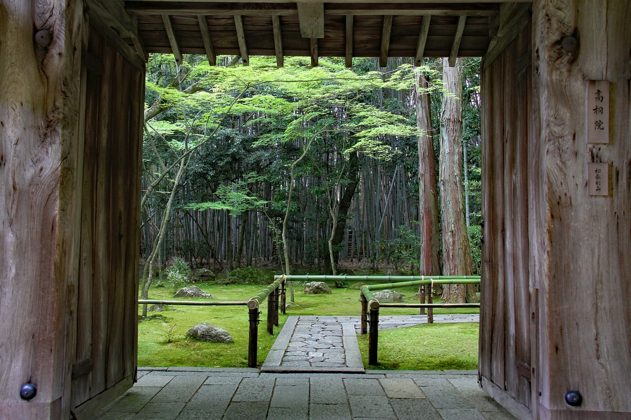
There was one place in particular that I will never forget. Its curved entrance was filled with a sudden fresh shadow, like a curtained corridor to another time and space. This path lined with bamboos and trees announced a moss garden into which I entered like slipping into a bath. Not only was the ground bright green, but the air felt green as well‚ saturated with freshness and moist fertility. In fact, the ground wasn’t made of soil, but instead of a soft cloudy fabric — perfect both from afar and up close. I was in my own personal heaven — unmatched until earlier today, when I fell asleep on a patch of moss while visiting one of Britanny’s islands… and woke up so happy with the sound of seagulls’ feathers over my head.
Even more than other monks, the monks from this temple must have loved moss — to create such a perfect place devoted to its aesthetical properties. Phosphorescent greens, deep and almost blue greens, soft almond and spicy pistachio greens, dark pine greens, combined into a single hue (call it: Kyoto Moss) that was everywhere, in my eyes, my lungs and my ears. I wanted to bottle this place to drink it, or else wrap it around me like a velvet coat.
Each spring I cannot wait for the baby leaves to jump out of their buds, just to see a similar green color: perfect, fresh, and so bright it seems unreal. Filling the air, eyes, and lungs with a pure essence of newness. Kyoto Moss is for me the color of pure bliss, and it’s the memory of the most perfectly designed place in the world.
COLOR CODEX: Martha Arango (Sweden) on FALUKORV RED | Rachel Lawes (England) on DEVIL GREEN | Audrey Bartis (France) on KYOTO MOSS | Maciej Biedziński (Poland) on SKIN-DEEP ORANGE | Natasha Delliston (England) on MARRAKECH MINT | Whitney Dunlap-Fowler (USA) on RESURRECTION CANARY BLUE | Ximena Tobi (Argentina) on VILLA MISERIA BRICK | Aiyana Gunjan (India) on LETTERBOX RED | Lucia Laurent-Neva (England) on TEAL BLUE VOYAGER | Charles Leech (Canada) on STORMTROOPER WHITE | William Liu (China) on PINING GREEN | Ramona Lyons (USA) on GOTH PURPLE | Greg Rowland (England) on LAUNDROMAT FUTURA | Sónia Marques (Portugal) on RUNAWAY BURRO | Max Matus (Mexico) on CALIFORNIAN BLUE | Chirag Mediratta (Canada / India) on AUROVILLE ORANGE | Alfredo Troncoso (Mexico) on BORGES GLAUQUE | Josh Glenn (USA) on TOLKIEN GREEN | Clio Meurer (Brazil) on PARIS LUMINOUS GREY | Serdar Paktin (Turkey / England) on AMBIENT AMBER | Maria Papanthymou (Russia / Greece) on AGALMATOLITE WHITE | Sarah Johnson (Canada) on ARMY GREEN | Vijay Parthasarathy (USA) on ALPHONSO YELLOW | Tim Spencer (England) on ELECTRO-EROTIC COBALT | Adelina Vaca (Mexico) on MEXICAN PINK.
Also see these series: COVID CODES | SEMIO OBJECTS | MAKING SENSE | COLOR CODEX

